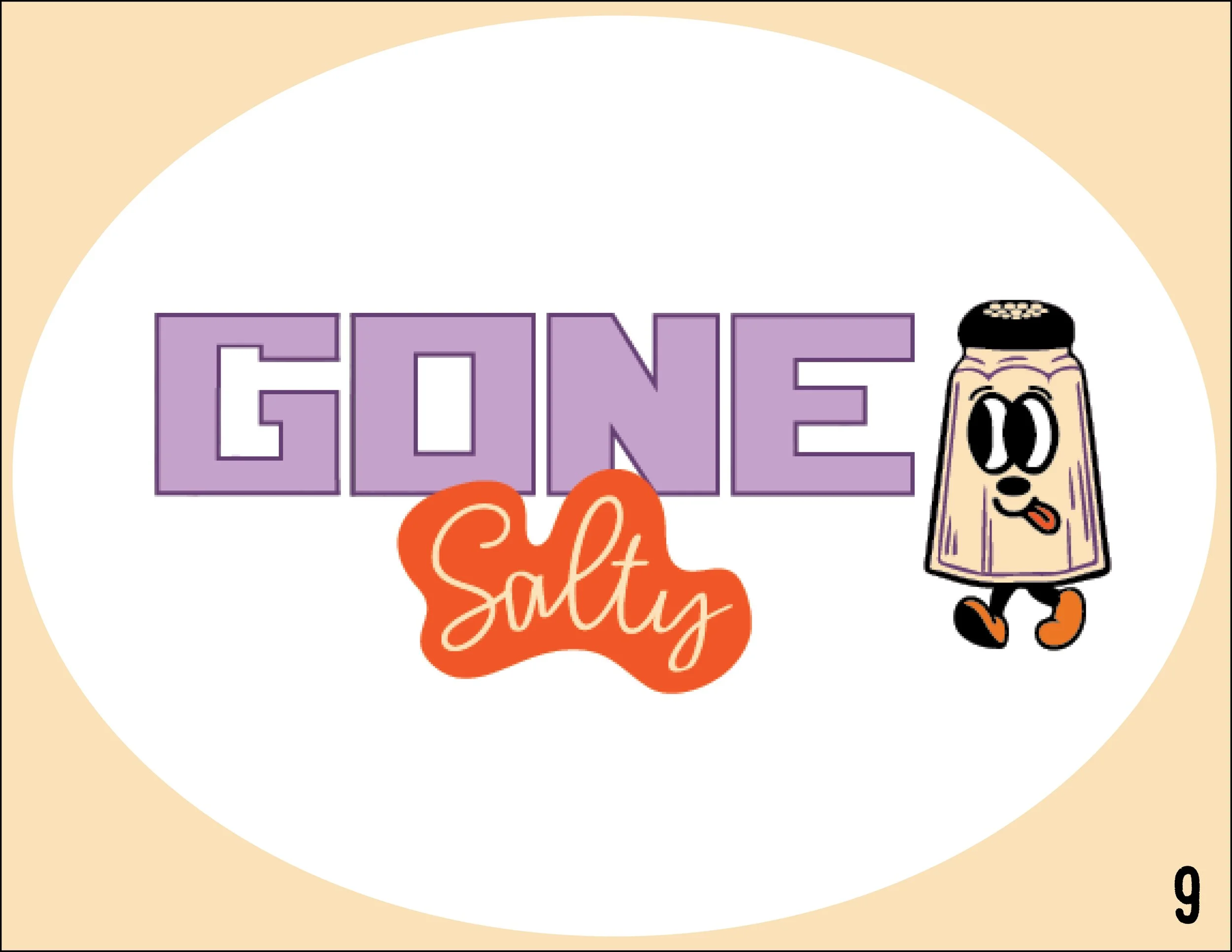

Gone Salty Chocolate Company
Branding, Logo and packaging Design
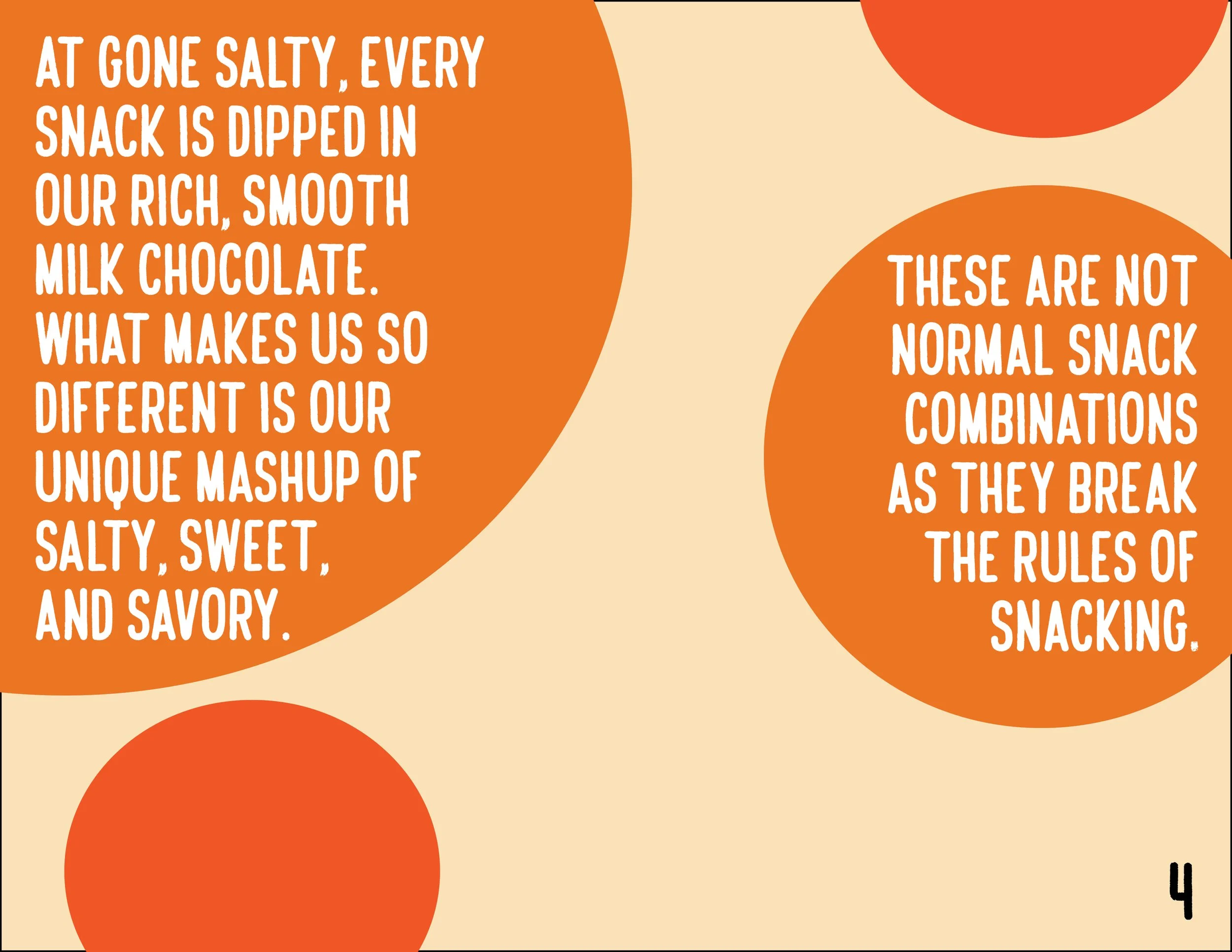
The guidelines were to create a chocolate company from scratch and to consider anything from the logos, to the branding, to the packaging, to the color theme, etc. The idea behind the brand was to create a chocolate company that creates snacking combinations that are sweet, salty, and savory at the same time. It’s for those who can’t decide what snacking mood they are in or even for those unique tastebuds who like the weird, unique combinations. Some of the various snacking options include Gummy Bears, Dehydrated Dill Pickle Chips, and Potato Chips. The mood board behind this brand was very retro/vintage, yet with a fun modern vibrant twist. The process started with deciding between logo options, creating the typeface, which then brought to the life the brand’s mascot dude.

Digital Logo Sketches

Typography Variations

Final Logo Design + Color Palette

Mockup of Various Products

Store Front Signage Mockup

Pin Mockup

Tote Bag Mockup

Social Media Post #1

Social Media Post #2
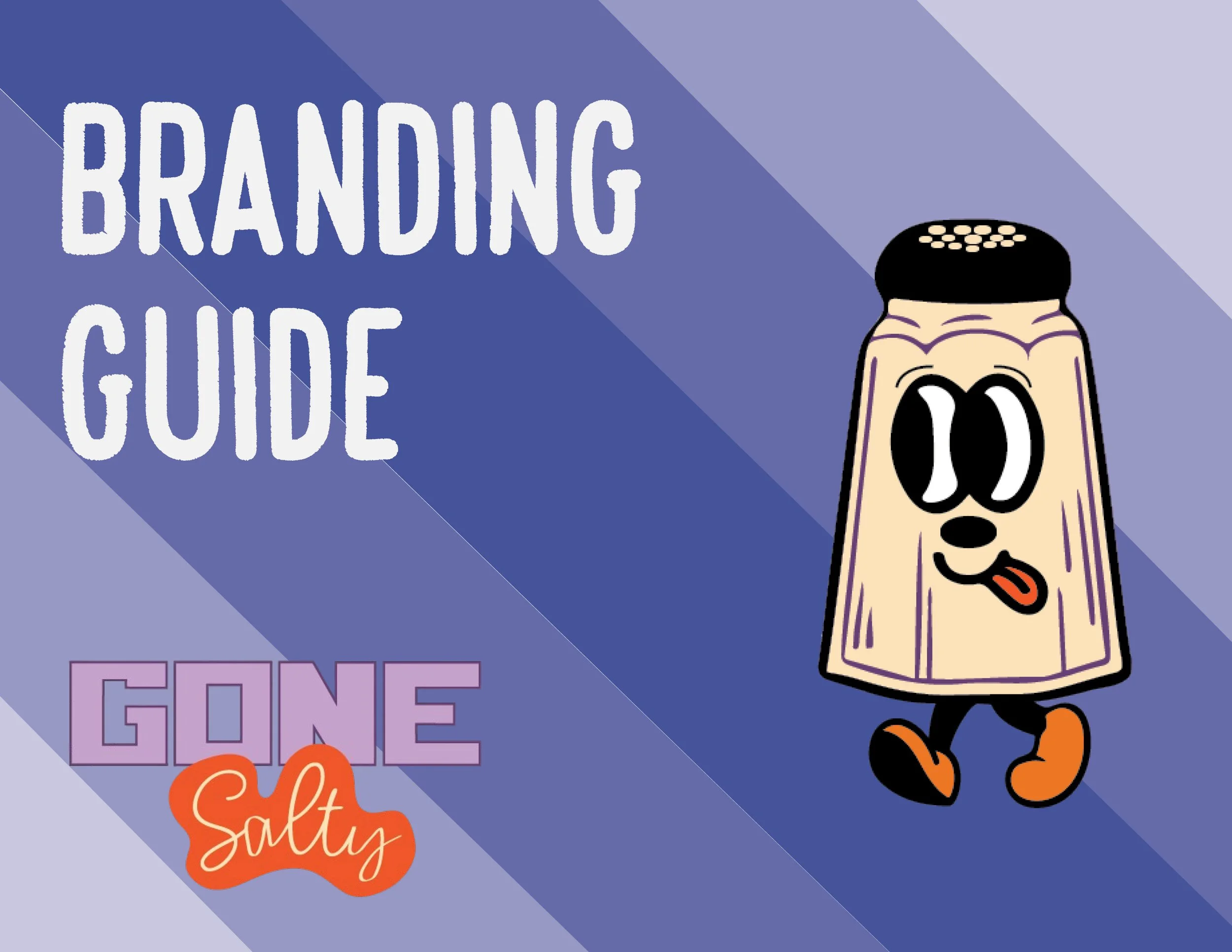
Gone Salty Branding Guide
A branding guide is a document that defines how a brand should be represented to the world, ensuring consistency in visual and verbal communication across all platforms. With this specific branding guide it highlights just that, as well as the color palettes, what the brand is about, what it’s mission and voice is, as well as mockups for the products. With the brand guide I wanted it to scream retro and I feel that it does just that and even more!
-
![]()
Branding Guide Cover
-
![]()
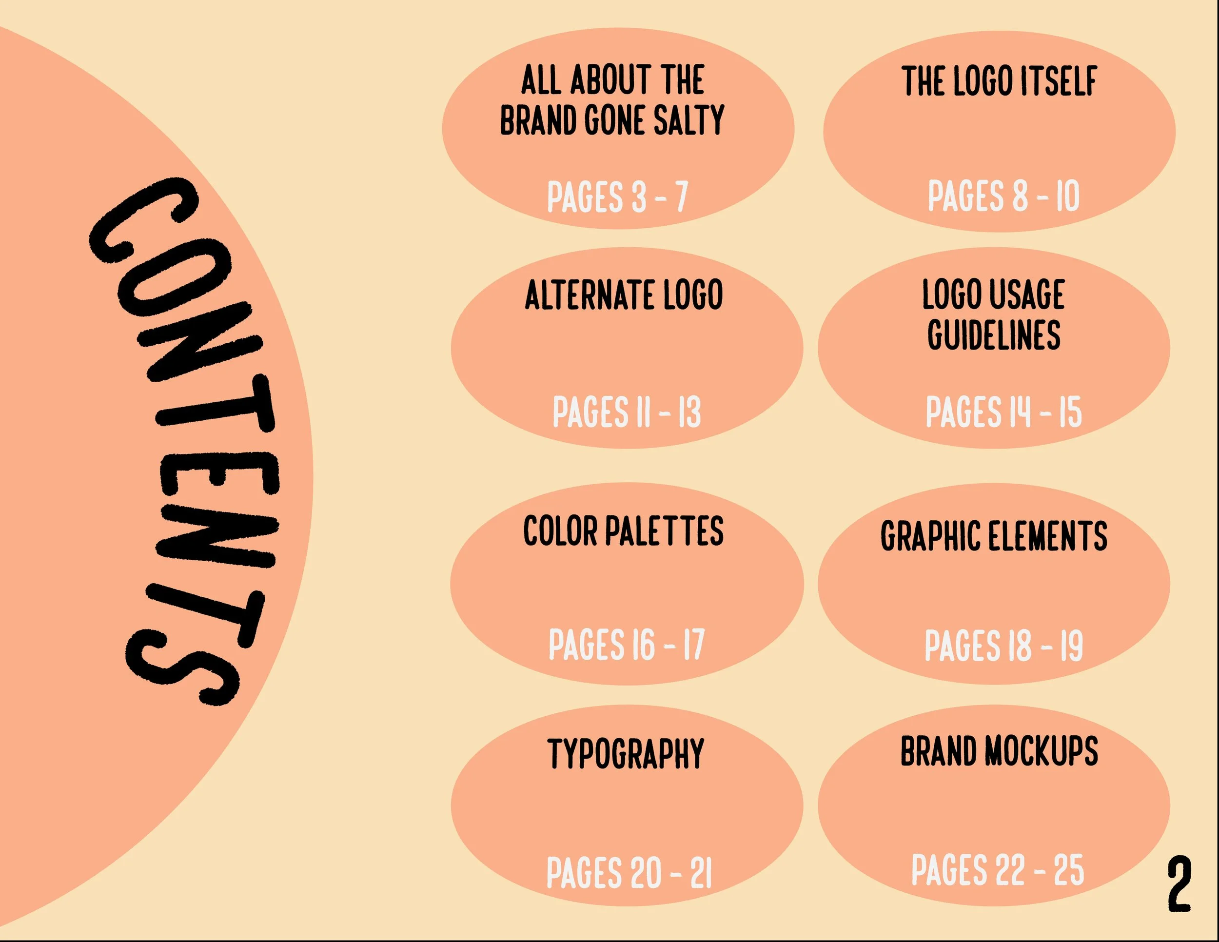
Table of Contents
-
![]()
Brand Overview
-
![]()
-
![]()
Mission Statement
-
![]()
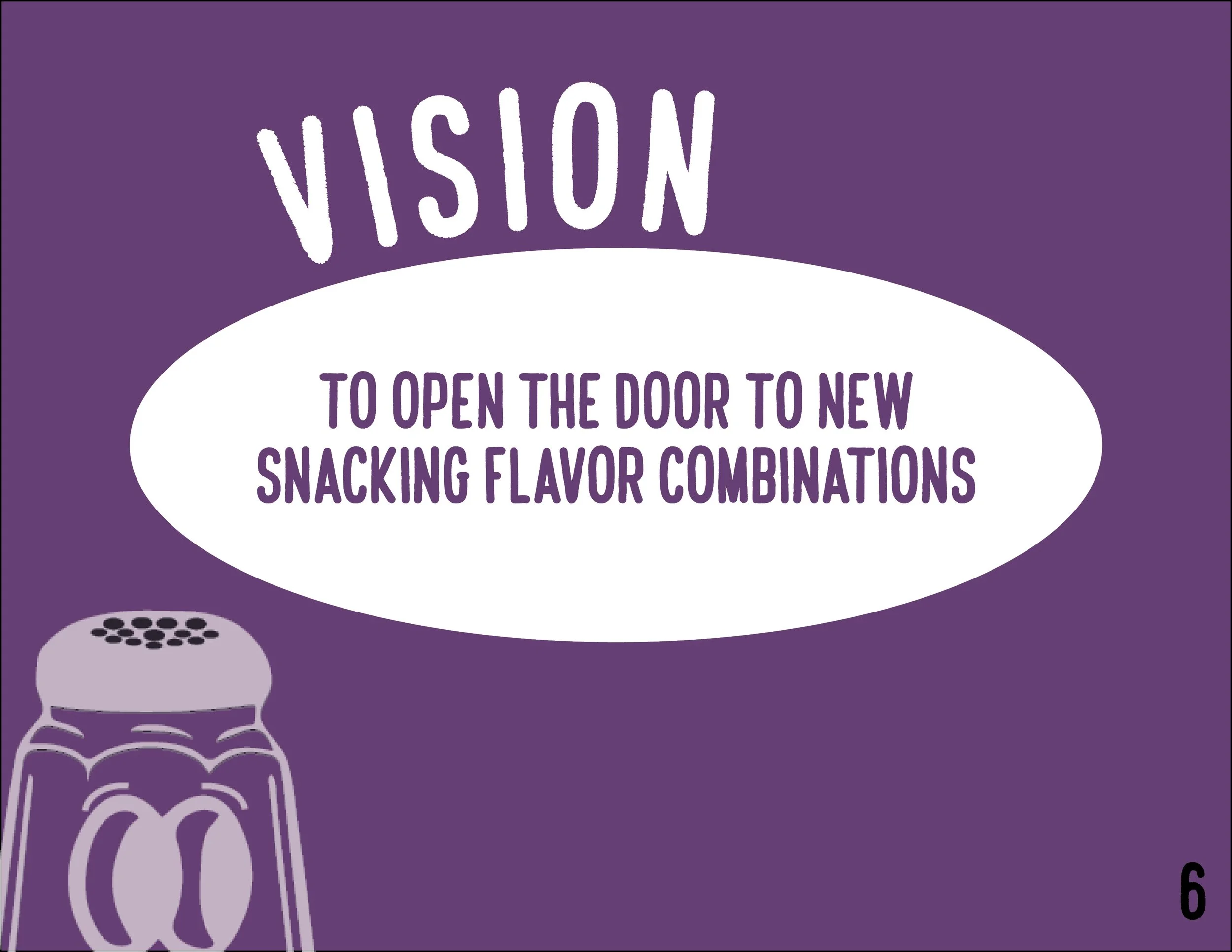
Brand Vision
-
![]()
Brand Voice
-
![]()
Logo Design
-
![]()
-
![]()
Logo Construction
-
![]()
Logo Variations
-
![]()
Alternate Logo
-
![]()
Logo Variations Pt. 2
-
![]()
Logo Usage Guidelines
-
![]()
What not to do with the Logo
-
![]()
Colors behind the brand
-
![]()
Logo Color Palette
-
![]()
Graphic Elements
-
![]()
Iconography + Patterns
-
![]()
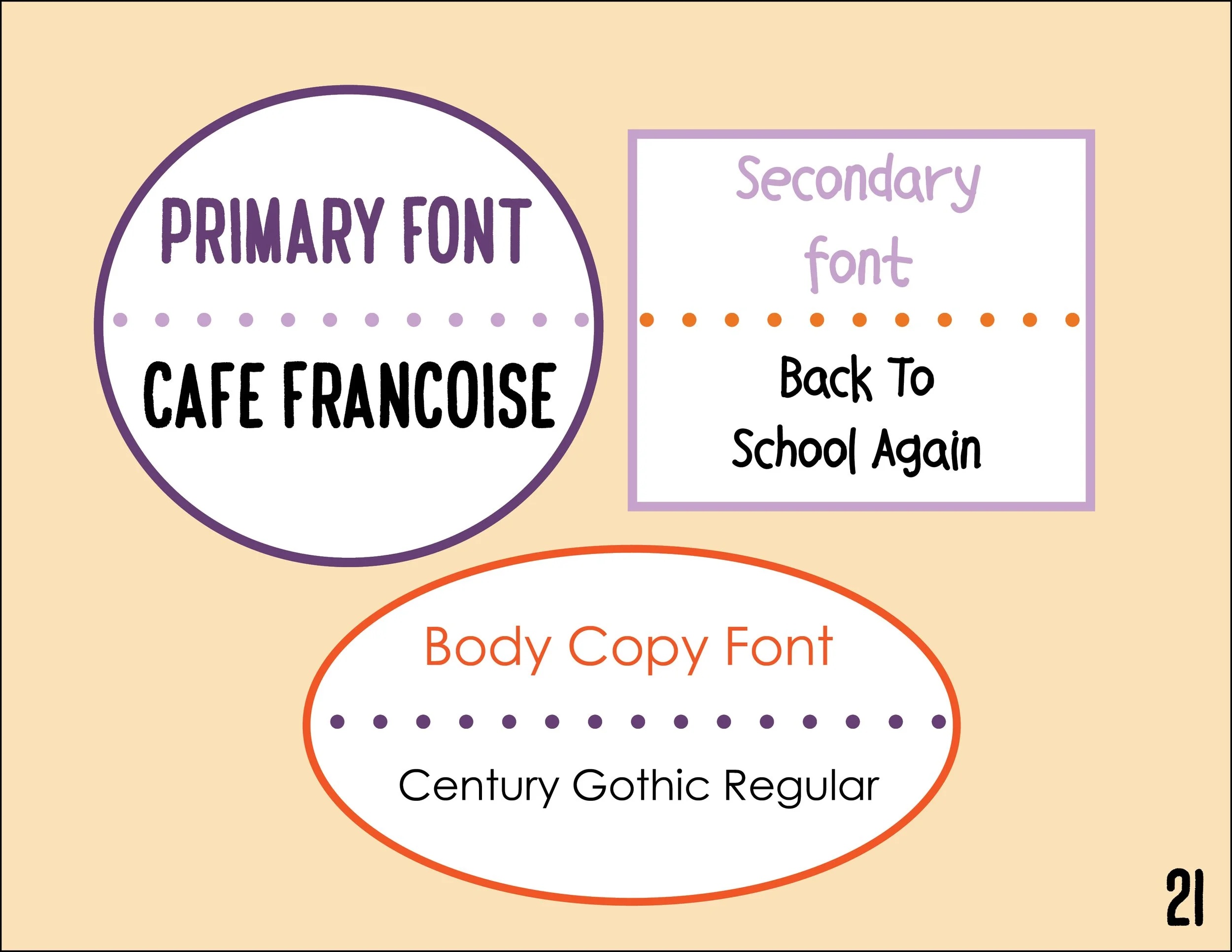
Typography Behind the brand
-
![Fonts + Font Pairings]()
New List Item
-
![]()
Brand Mockups
-
![]()
Packaging Mockups
-
![]()
Merchandising + Signage Mockups
-
![]()
Business card + Mailing Envelope Mockups